
Overview
A fabrication shop website built around the way contractors and facility buyers actually use a shop site: verify capability fast, find the right service path, get a form or reference, and make contact without digging.
The old trap for this kind of site is brochure thinking: vague capability claims, stock-like copy, and a contact page doing too much work. This rebuild puts the useful things closer to the surface: real job photos, service categories, quote paths, resource links, and mobile layouts that still make sense from a truck or jobsite.
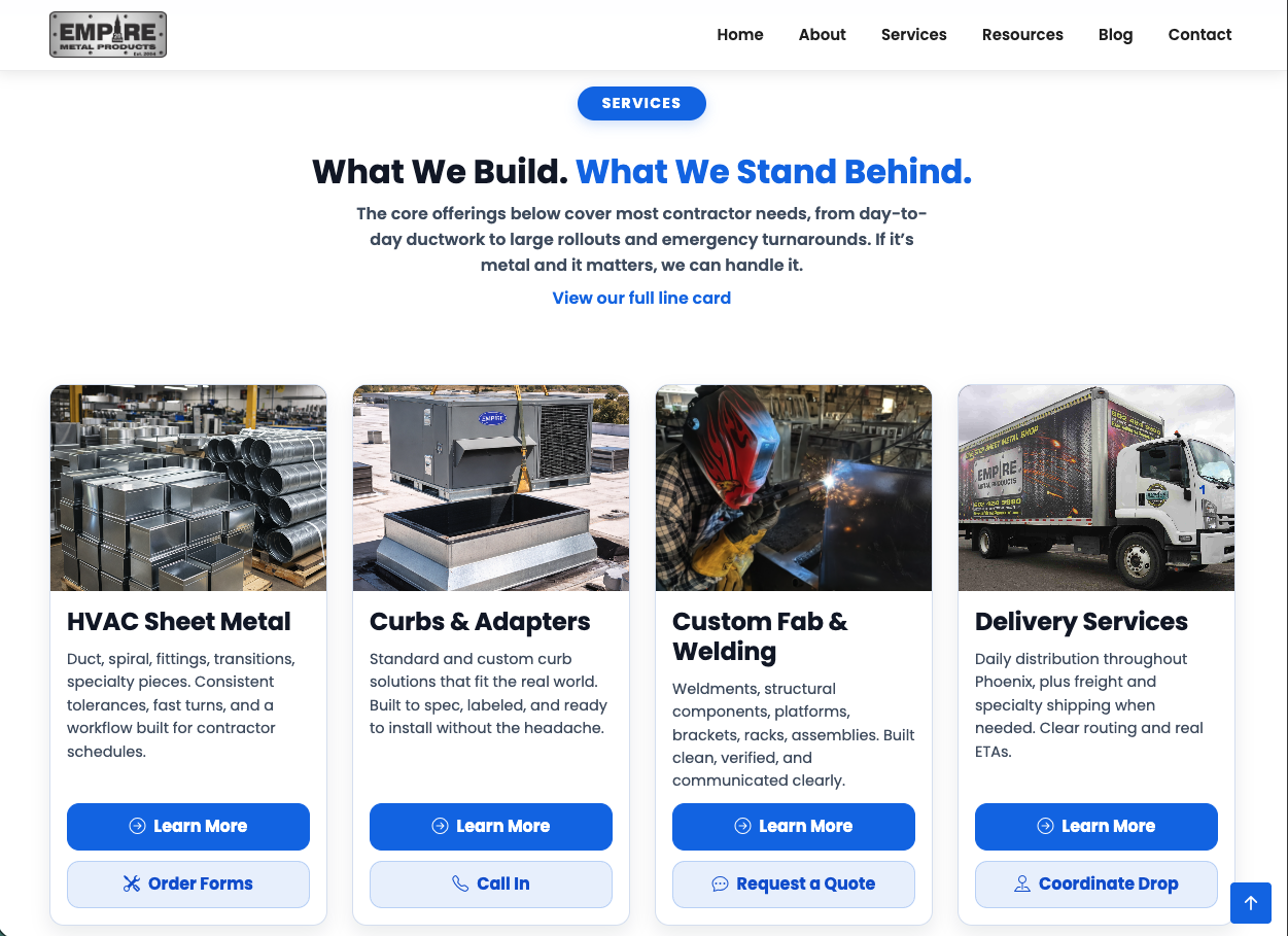
The information architecture separates the shop's work into recognizable lanes: HVAC sheet metal, curbs and adapters, custom fabrication, delivery, and resources. Each page is written to answer buyer questions before the phone call: what the shop does, what kind of work fits, what to send, and how to take the next step.
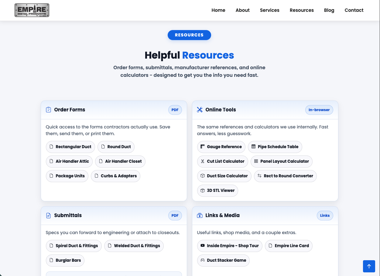
The Resources hub is the functional shift. Instead of burying order forms, submittals, and calculators behind counter calls, the site gives contractors direct access to routine documents and tools. That makes the website part of the shop workflow, not just a digital sign.
This is not a brochure site. It is a working extension of the shop floor and the front counter.