Adventure Time Memorial Golf Outing

Adventure Time Memorial Golf Outing homepage
Homepage Registration flow Sponsorship flow
Web Design Stripe Google Sheets Registration Flow Sponsorship Checkout
Overview

A memorial event site built to honor my cousin and to make registration, sponsorship, and payment feel respectful, clear, and easy for the people showing up to support it.

This project was personal from the start. The Adventure Time Memorial Golf Outing was created in honor of my cousin, Stephanie Follin, so the site had to do more than look polished. It needed to feel respectful, clear, and easy to use while helping people support something that mattered to our family.

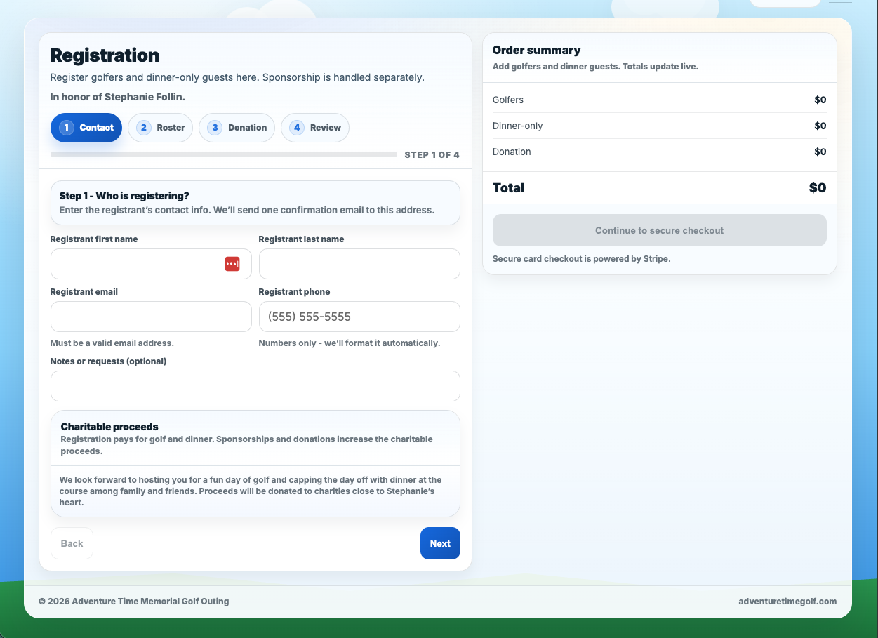
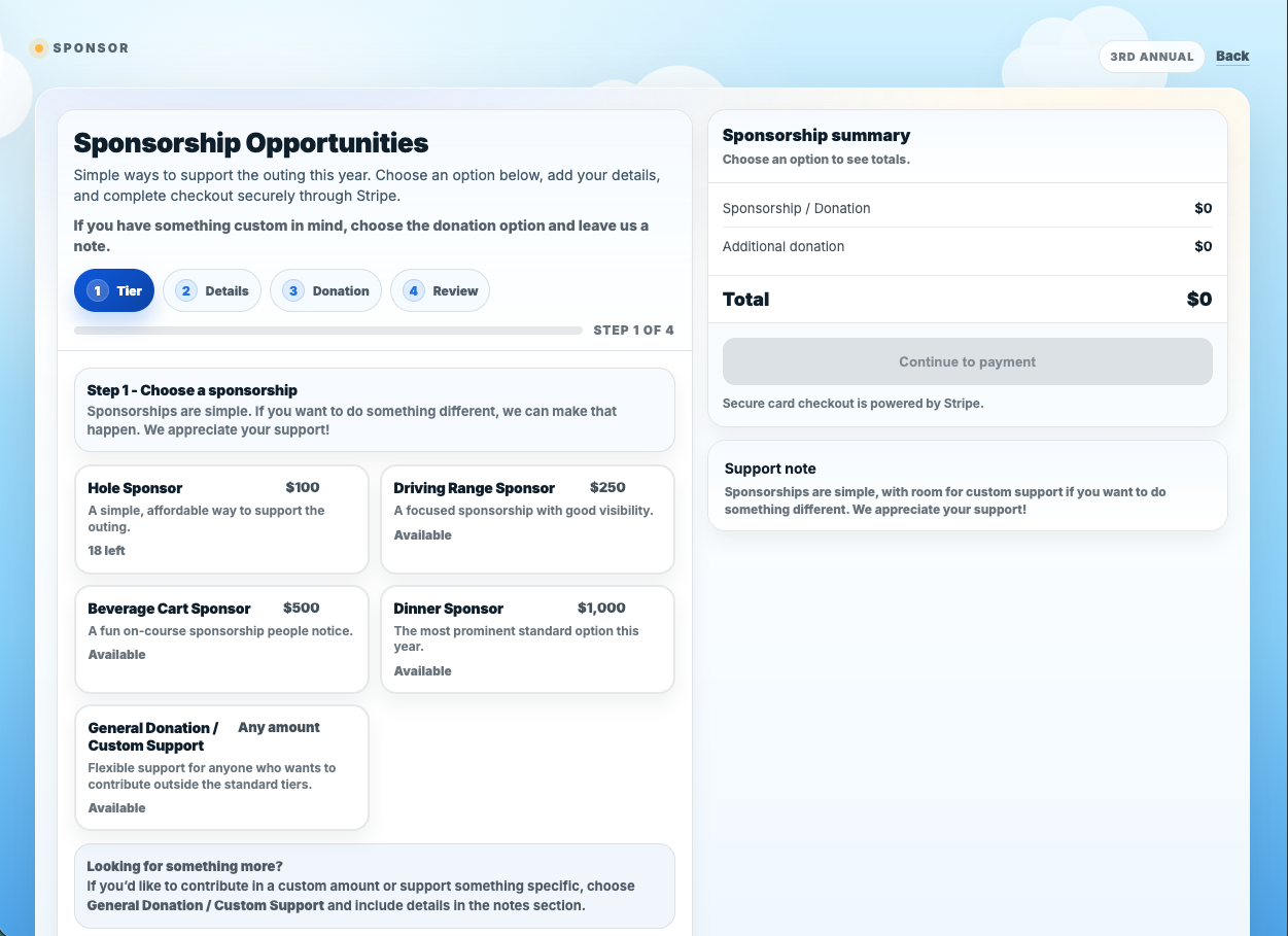
On the public side, the site had to explain the outing, carry the right tone, and make the event feel welcoming without slipping into generic fundraiser language. On the functional side, it had to handle golfer registration, dinner guests, sponsorships, payments, and organizer visibility in a way that felt smooth instead of emotionally exhausting.

That meant building two distinct but connected flows, one for golfer and dinner registration and one for sponsorships, then tying both into Stripe checkout and Google Sheets so the event team had clean records instead of scattered emails, manual counting, and guesswork.


Problem
The outing needed a site that could honor Stephanie properly while also handling real registration, payments, and sponsorships without confusion.
Solution
Build a warm public-facing event site up front, then support it with guided checkout flows and a backend that logs every paid registration cleanly.

The goal was simple: make it easy for people to support the outing without needing help, clarification, or hand-holding at every step.

At a Glance
Project
Adventure Time Memorial Golf Outing
Role
Design · UX · Checkout flow · Integration
Stack
HTML/CSS/JS · Stripe · Google Sheets · Apps Script
Core Need
Registration, sponsorships, payment, and organizer visibility
Audience
Golfers · family · donors · sponsors · organizers
Why It Mattered

This was not just another event website. Because it was built around a memorial for my cousin, the tone had to be handled carefully. It needed warmth and dignity, but it also needed to work like a real event platform.

If the experience felt clunky or confusing, that would have undercut the whole purpose. The site had to help people show up, participate, and support the outing without friction.

What Changed
  • The public-facing page gave the outing a real home instead of scattered event details.
  • Golfer and dinner registration moved into a guided step-by-step flow.
  • Sponsorships became a separate clean checkout path instead of a manual process.
  • Paid activity could be logged and tracked in Google Sheets for the organizers.
What The Screens Show
Public Event Page

The homepage carries the event tone and makes the main choices obvious right away: register, sponsor, or save the date. It feels like a real event site, not a patched-together form page.

Registration Flow

Golfers and dinner guests move through a guided step-by-step process with a live order summary. That keeps the flow understandable and cuts down on mistakes before checkout.

Sponsorship Flow

Sponsorships are handled separately so that support options stay clear and structured. It gives sponsors a cleaner path and makes the organizer data easier to manage on the back end.

Operational Side

Stripe handles payment, while the event data can be pushed into Google Sheets so organizers can actually work from a live record instead of digging through inboxes.

What I Built Into It
Respectful Tone

The visual style and copy had to support the reason for the outing without getting heavy-handed. The balance mattered because this was about honoring someone real.

Clear Registration UX

Multi-step registration breaks the process into manageable pieces and gives users confidence about where they are and what they are paying for.

Separate Sponsorship Logic

Sponsors do not behave like golfer registrations, so the sponsorship side needed its own flow, pricing logic, and review structure.

Live Organizer Visibility

Payment is only part of the job. The event team also needs clean usable records, so the site was built with operational follow-through in mind.

My Take

What makes this project strong is that it had to be both human and functional. It could not lean too hard in either direction. It needed to feel personal enough to matter, but structured enough that people could register, sponsor, and move on without getting lost.

  • Respect the reason for the event.
  • Keep the choices obvious.
  • Make the back end just as usable as the front end.
What I’d Do Next
  • Add a cleaner admin-side reporting view for registrations and sponsorship tiers.
  • Expand confirmation messaging and follow-up email presentation.
  • Keep refining mobile polish since a lot of event traffic comes from phones.
  • Build out repeatable pieces so future event years can be rolled forward faster.
Project Outcome

The final result is a site that gives the outing a real home, makes participation easier, and supports the organizers behind the scenes. More importantly, it does that while still feeling connected to the reason the event exists in the first place.

For me, that is what made this one different. It was not just about building a checkout flow. It was about building something useful around someone who mattered to my family.

Need something like this?

Let’s build something clear, respectful, and easy to use.

I can help with event sites, registration flows, payment handling, and the operational side that makes them usable after launch.

Contact

Tell me what you're building, fixing, or trying to figure out. I'll read it and get back to you.